Project Overview
The Product:
La Fleur is a trendy florist that is in need of an app for their customers to order bouquets online. The target audience is trendy young and middle aged adults.
Project Duration:
Sept 2021 - March 2022
The Problem:
The florist lacks a quick and easy way for the customers to view and purchase floral arrangements.
The Goal:
To create an app that customers can complete orders easily.
_________________________________________________________________________________________________________________________________________
Understanding the user
User research consisted of interviewing 5 participants on their bouquet purchasing habits. Participants expressed that ordering bouquets online could be efficient but there is a possibility bouquet expectations will not be met upon delivery.
User Research: Pain Points
Difficulty
Users need an easy process of ordering a bouquet in-app.
Viewing
Users need to have a preview of the bouquet they are ordering.
Knowledge
Give users a way to learn more about flowers in order to get the most out of their bouquet
_________________________________________________________________________________________________________________________________________
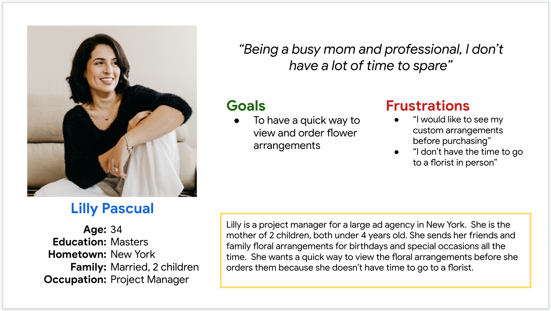
Persona: Lilly Pascual
Problem Statement:
Lily Pascual is a busy working mom who needs a quick and easy way to view and order flower arrangements.
___________________________________________________________________
______________________________________________________________________
______________________________________________________________________
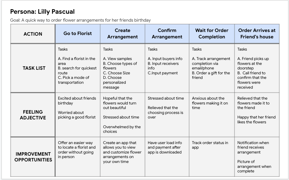
User Journey Map
The goal was to figure out the process of buying a bouquet in person.
____________________________________________________________________
____________________________________________________________________
____________________________________________________________________
Starting the Design
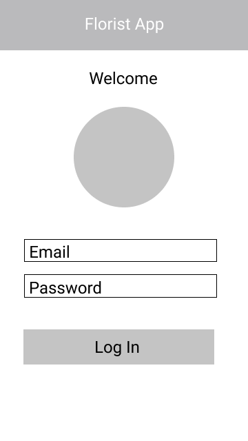
Login
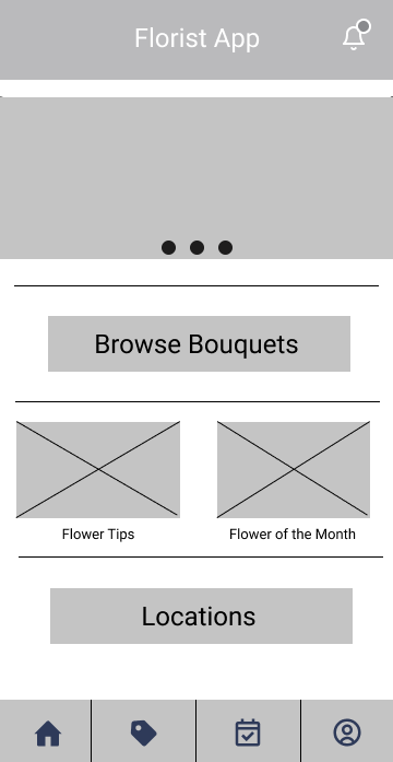
Home

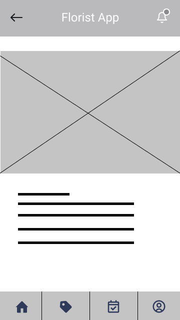
Bouquet Selection
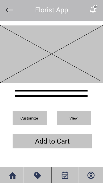
Bouquet Profile
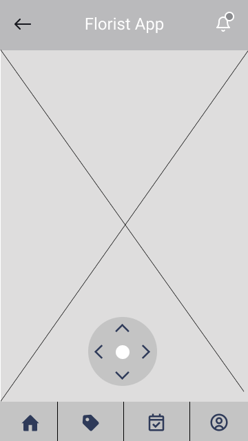
Bouquet View
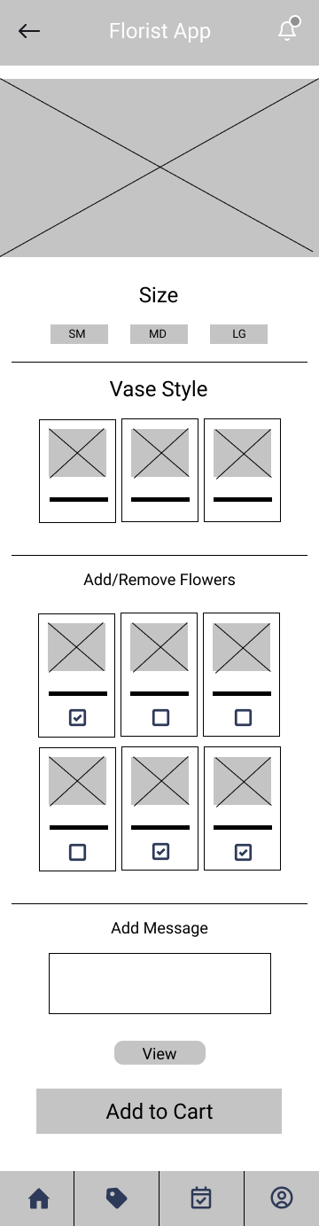
Bouquet Customization
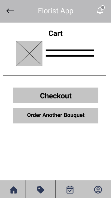
Cart
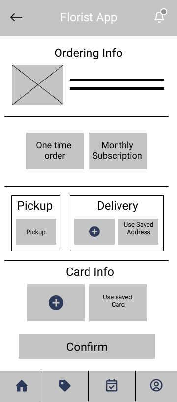
Ordering
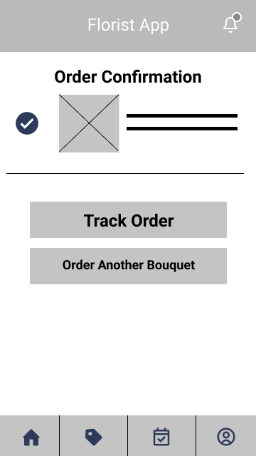
Order Confirmation
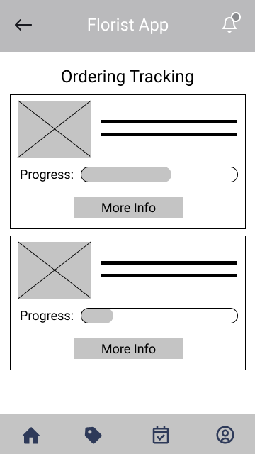
Order Tracking List
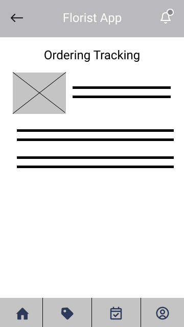
Order Tracking Details
Flower of the Month
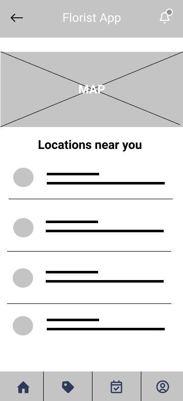
Locations
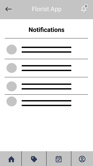
Notifications
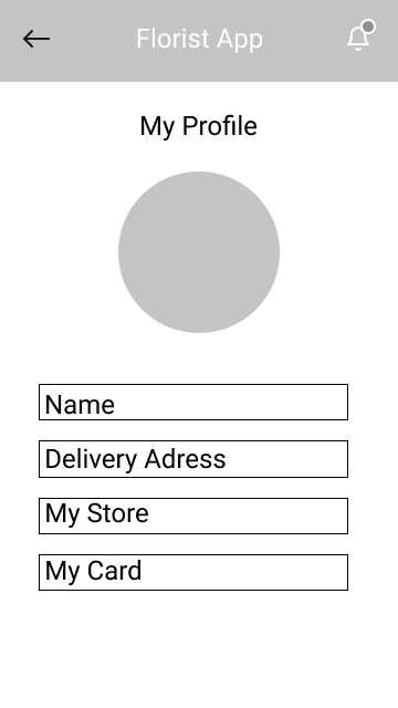
Profile Info
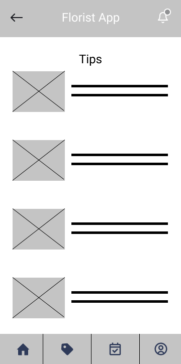
Tips
__________________________________________________________________
__________________________________________________________________
__________________________________________________________________
USABILITY STUDY: FINDINGS
An usability study was conducted with 5 participants via Maze.com. Participants were tasked with selecting a bouquet, customizing it, and then completing the order.
Round 1 Findings
Users need more information in order to navigate the app.
Users need a clearer path to the bouquets.
Users need the button descriptors/CTAs to be easily understood.
Round 2 Findings
“Browse Bouquets” was more effective CTA than “Order Now.”
“View” was more effective CTA than “360 View.”
______________________________________________________________________________________________________________________________________
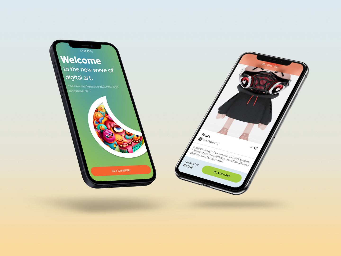
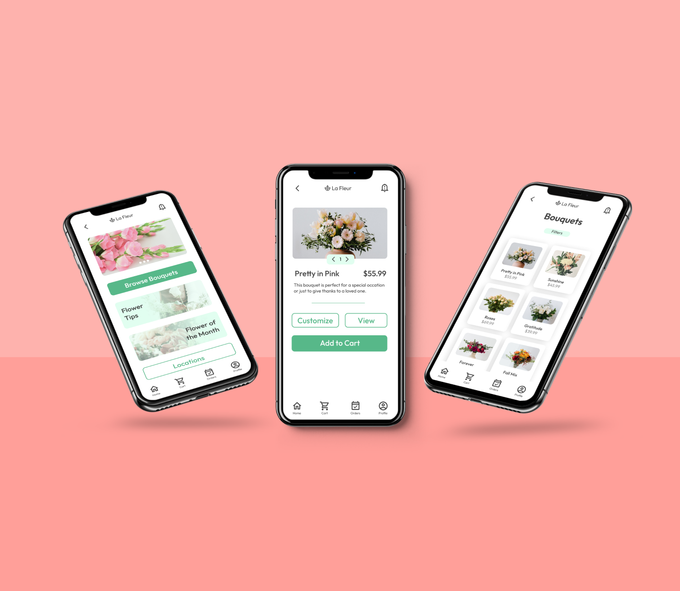
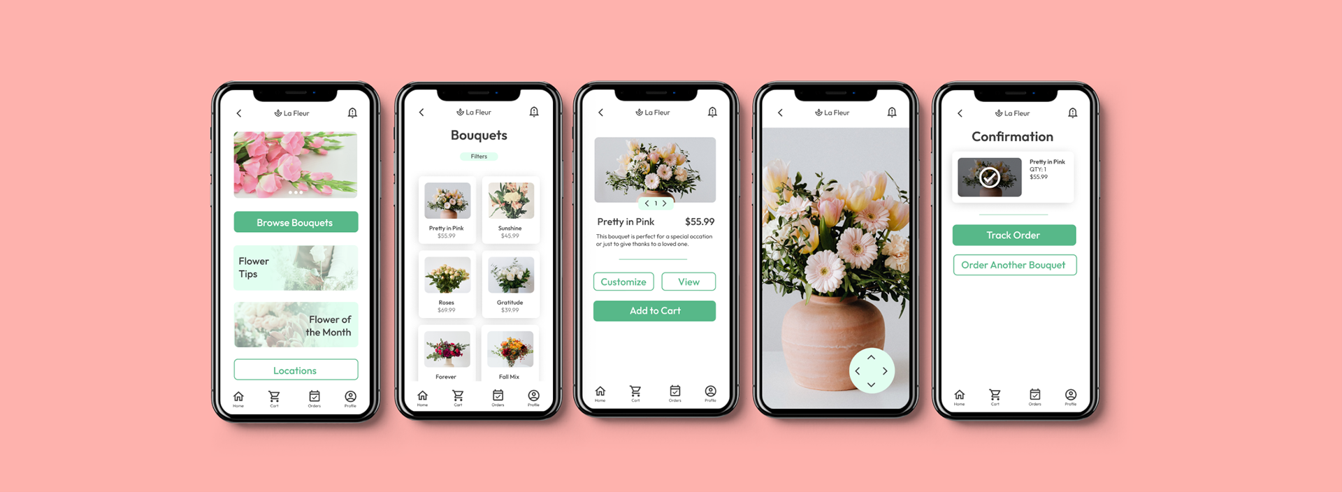
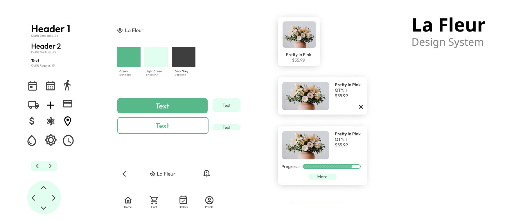
HI-Fidelity PrototypesS
Sleek and breathable design incorporating green that represents growth and nature
______________________________________________________________________________________________________________________________________
ACCESSIBILITY Considerations
Large viewable image of selected bouquets - Easy for users with limited vision
One handed use - Easy for users who may have a disability
Page transition animations - Easy for users to have a responsive experience
______________________________________________________________________________________________________________________________________